01/
PROJECT
OVERVIEW
Google and Huge formed a strategic partnership for the design of their products and marketing materials. This collaboration involved working closely with Google to create stunning websites that enhance their communication with customers worldwide. Through our expertise, we helped Google deliver exceptional digital experiences that align with their brand and drive engagement across various platforms.
Role
Senior Visual Designer
Duration
Until Today
Year
2020
TEAM/
A bunch of Hugers
A bunch of Googlers
Great People!
02/
MY ROLE
I have been fortunate to work on multiple diverse projects for Google, ranging from assisting with the designs of the Google Pixel Watch Assistant to creating marketing websites for Chrome. In these projects, I played a crucial role in conceptualization, ideation, and product development, collaborating closely with UX designers, Creative Directors, and the Google team. It has been an exciting journey working alongside talented professionals to bring innovative and impactful experiences to life for Google's products.
03/
DESIGN
PROCESS
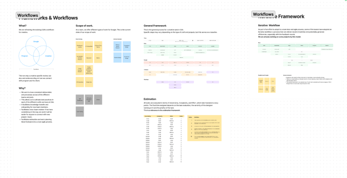
For each project, the design process is different. The first step is always to understand the nature of the requirement and which department of Google it is intended for, as Android, Google, and Assistant have different visual treatments. We conduct thorough research and work closely with the Google teams to define the creative direction and establish design goals. We then delve into creating sketches, prototypes, and iterative testing to ensure that the design meets the highest standards of quality and delivers an exceptional user experience.
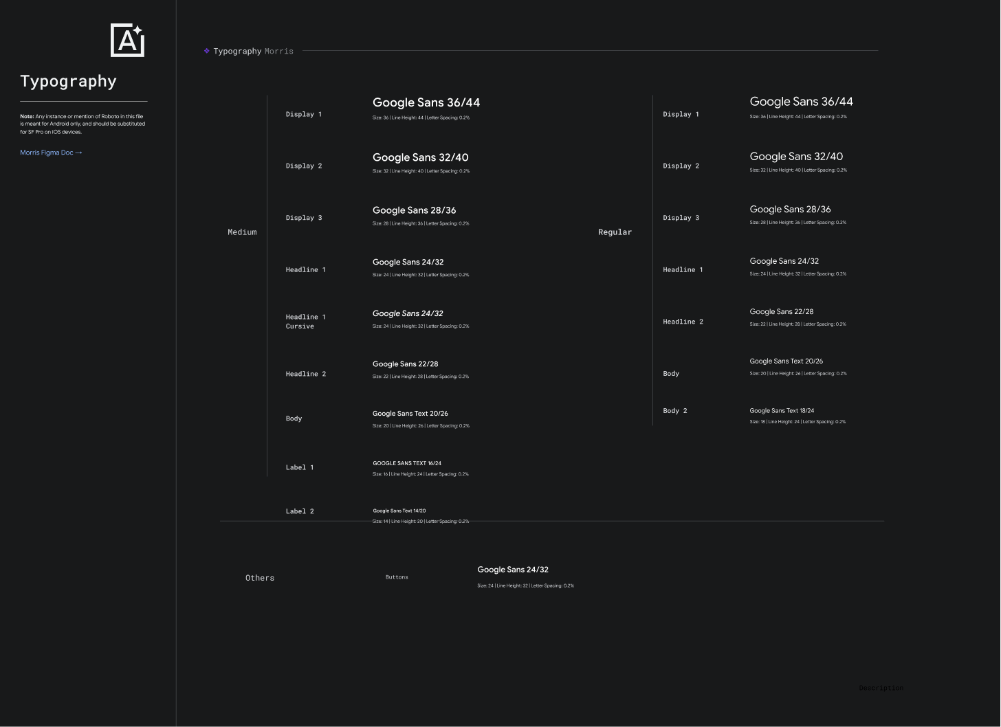
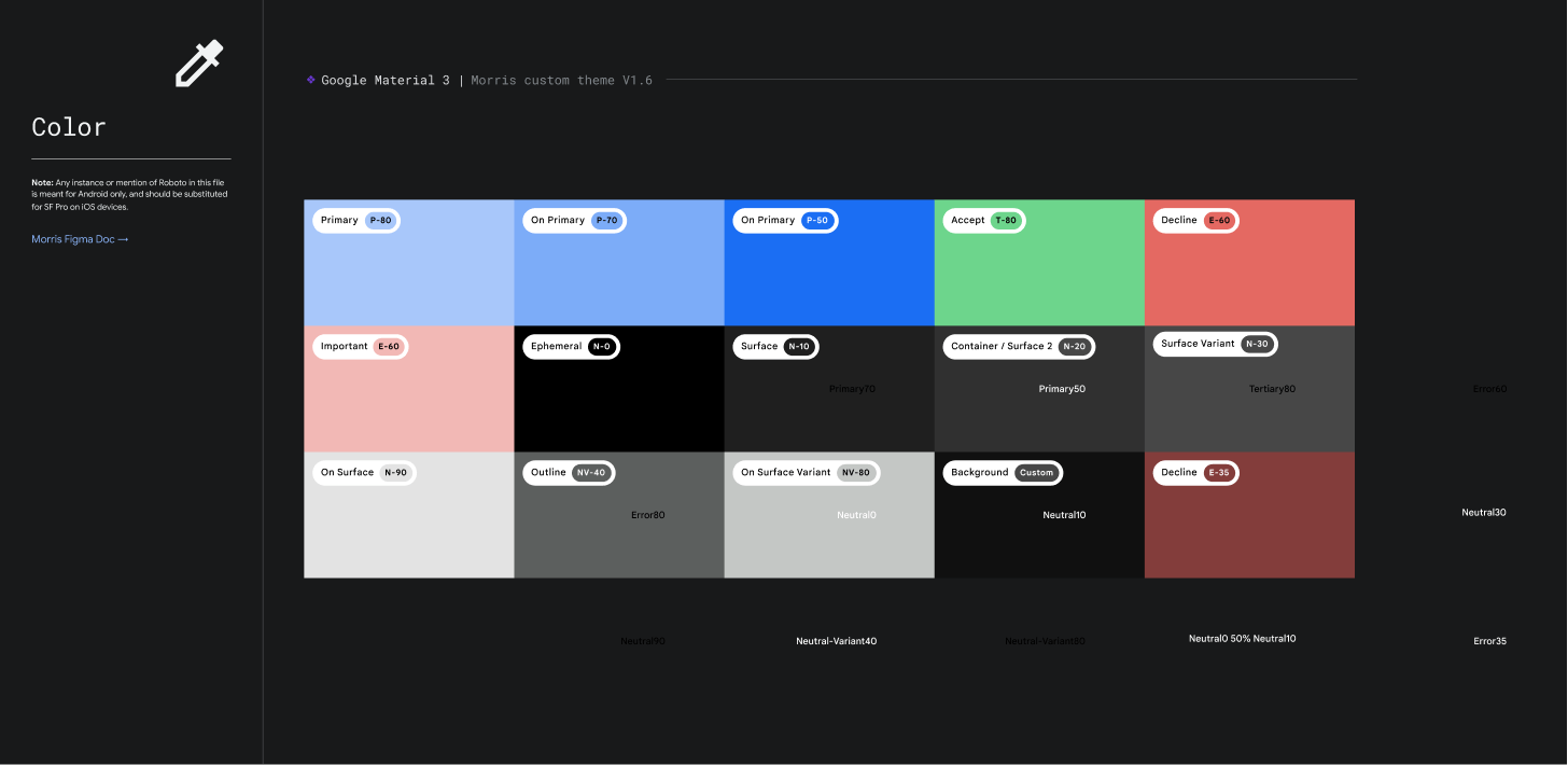
DESIGN SYSTEMS/
Given the nature of the client and their collaboration with multiple agencies worldwide, this is a vital component to maintain consistency and uphold the high standards of quality required by the brand. We collaborate closely with the Google teams to ensure that the Design Systems are comprehensive, accessible, and scalable, enabling efficient and cohesive design across various Google products and platforms.
MULTIPLE PROJECTS/
Adapting to diverse projects is essential in our partnership with Google. At Huge, we have a framework that enables us to understand Google's brand, clients, and users, ensuring tailored and impactful solutions. Our deep understanding of project requirements allows us to deliver designs that align with Google's vision and resonate with its audience.
04/
PROJECT
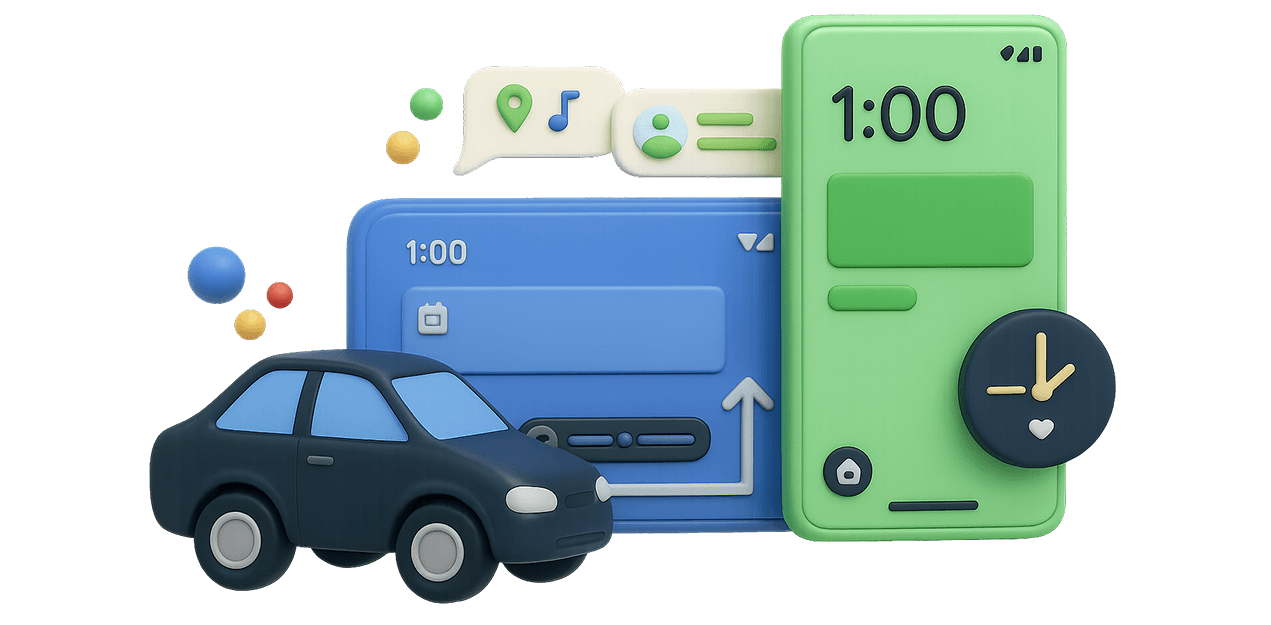
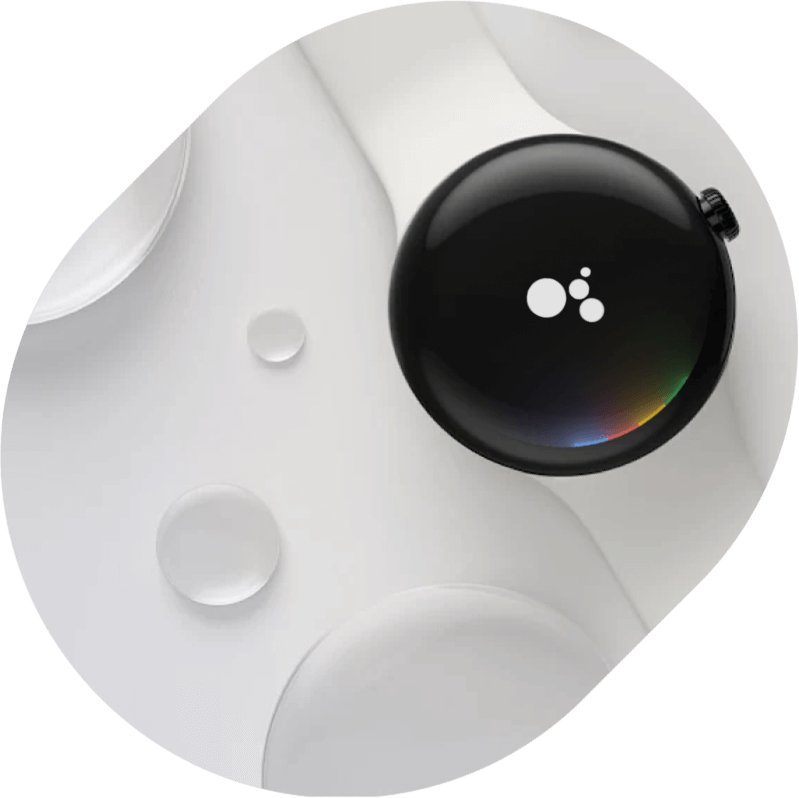
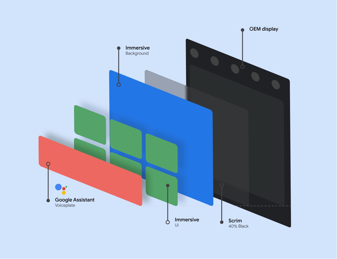
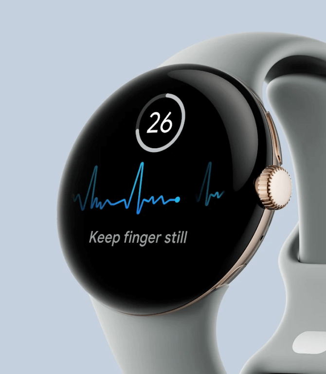
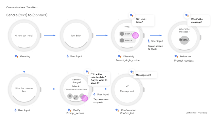
GOOGLE PIXEL WATCH
The first official smartwatch by Google, was a project where we pushed the limits of Wear OS to deliver an exceptional user experience.
THE GOAL/
Our goal was to enhance the Google Assistant experience on the Pixel Watch by solving disambiguation challenges. We designed intuitive interfaces for seamless communication and accurate responses, ensuring a smooth user experience.
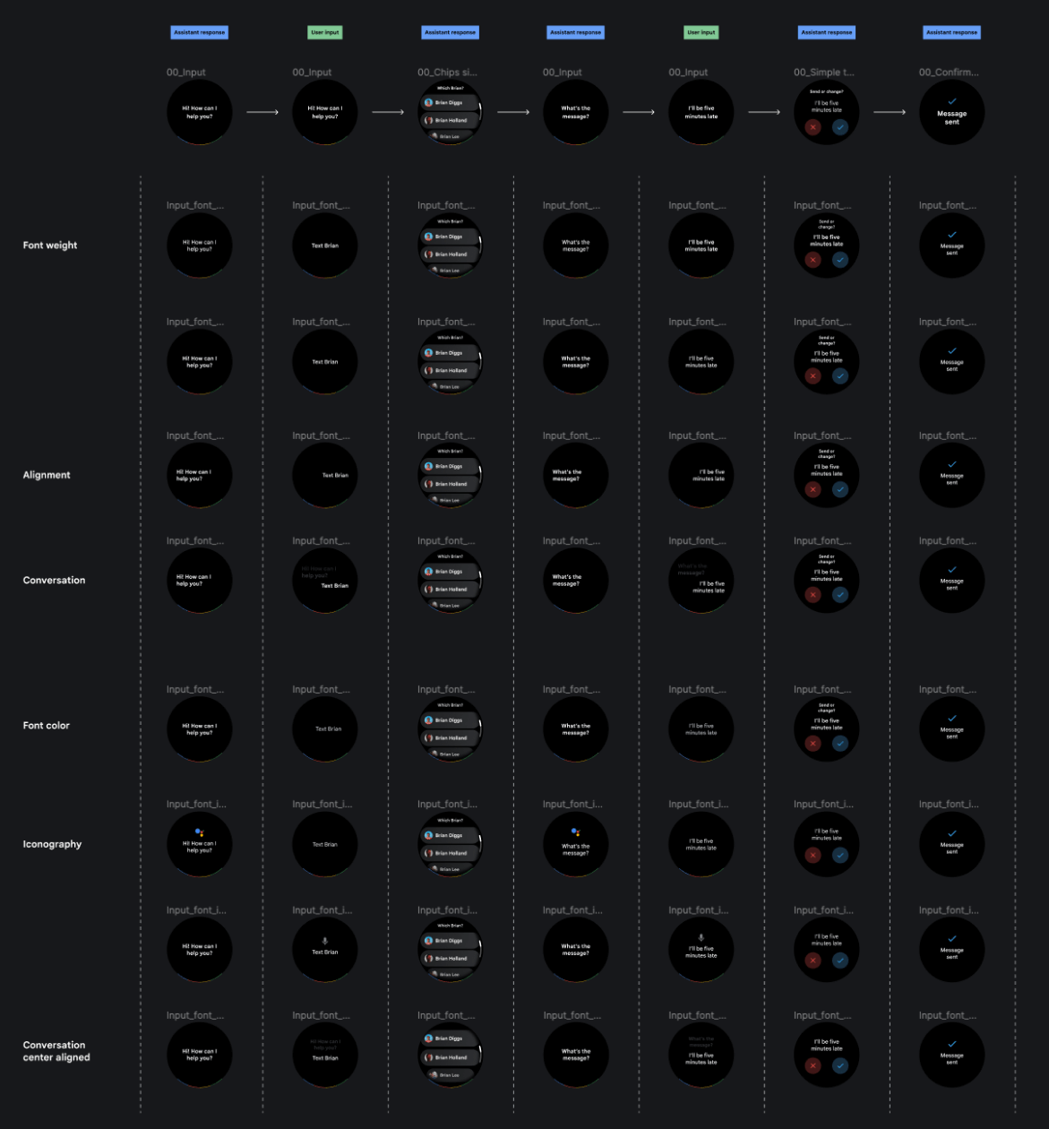
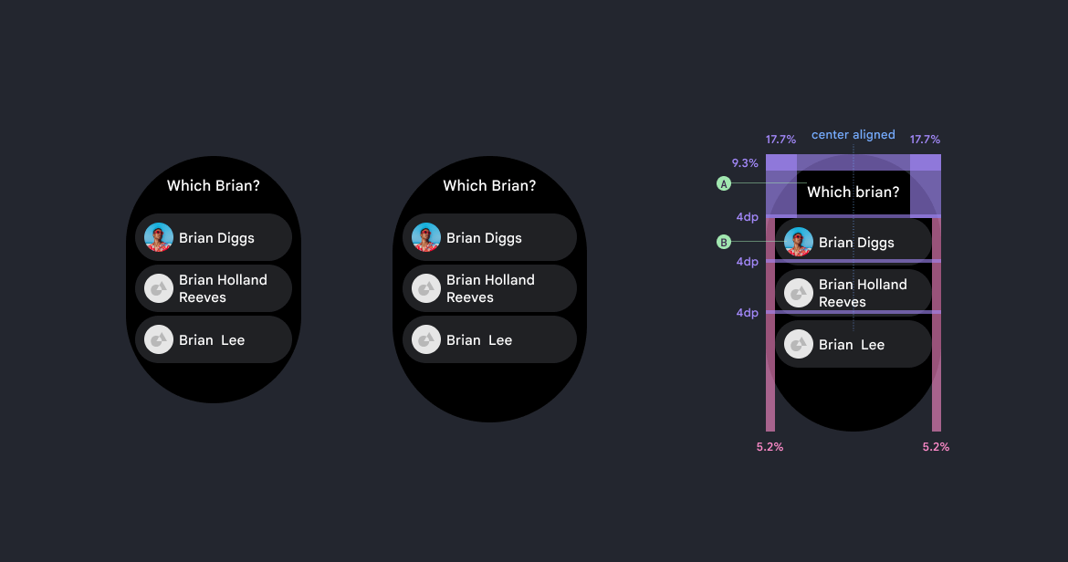
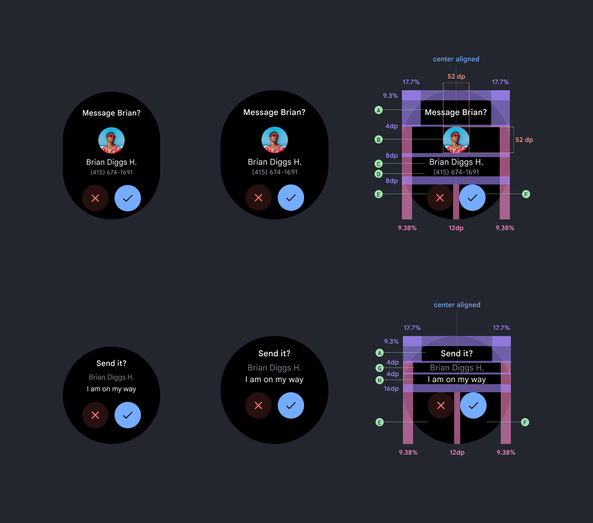
CUJ/
Critical User Journeys were crucial in identifying and addressing user flow ambiguities. Working closely with Google's designers, we conducted explorations to improve the user experience. By understanding the pain points and challenges within the user journey, we crafted effective design solutions that enhanced usability and clarity.
VISUAL DESIGN/
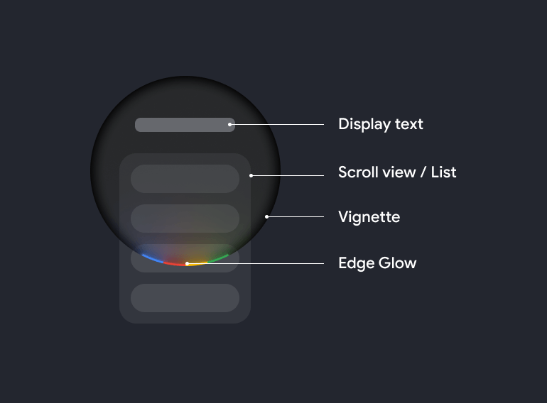
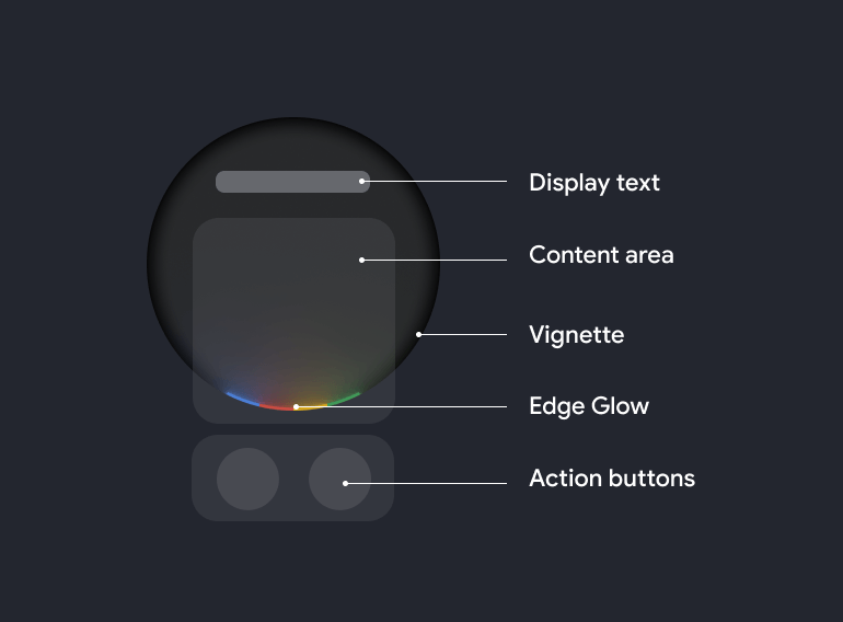
Through multiple iterations, we crafted a visually compelling and user-friendly interface for the Google Pixel Watch. Leveraging Google's established visual language for watches, we ensured the interfaces had excellent glanceability and were easily comprehensible within the limited screen space. The result was an intuitive design that delivered information efficiently and enhanced the overall user experience.
DELIVERABLE/
Our final deliverable consisted of a comprehensive set of guidelines and specifications for the developers working on the Google Pixel Watch. These guidelines outlined the rules and best practices they needed to follow to ensure consistent and high-quality designs across the watch's interface.
05/
PROJECT
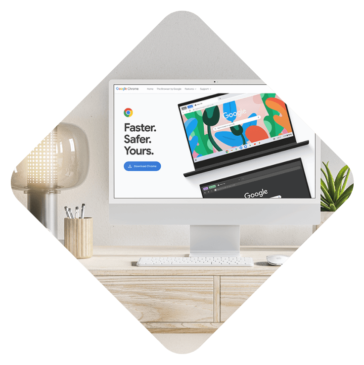
GOOGLE CHROME
The ever-evolving browser, the most widely used of its kind, is on a mission to reach even more users.
THE GOAL/
To encourage a larger global user base to choose and download Google Chrome over other browsers in the market, we established a dedicated Laboratory team. This team focused on creating innovative components and conducting explorations to enhance the website experience and attract more users.
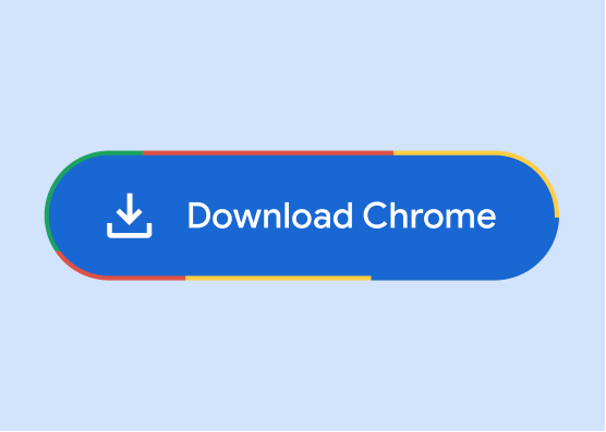
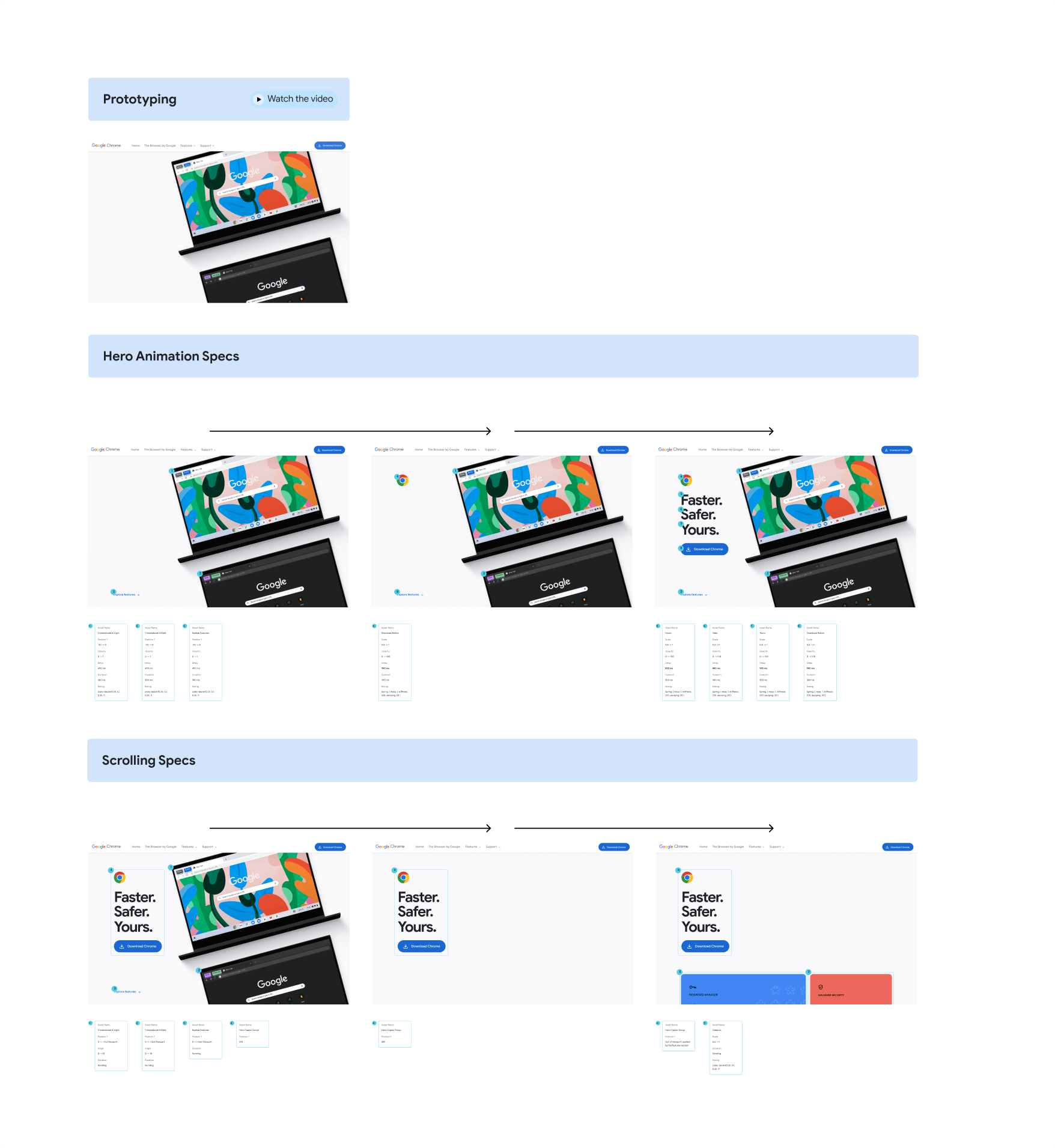
THE BUTTON
From the start, we recognized that the download button for Google Chrome was dull, inconspicuous, and lacked appeal. We embarked on creating a new version of the button that met all accessibility requirements and Google's standards, while also being visually engaging and dynamic to capture attention effectively.
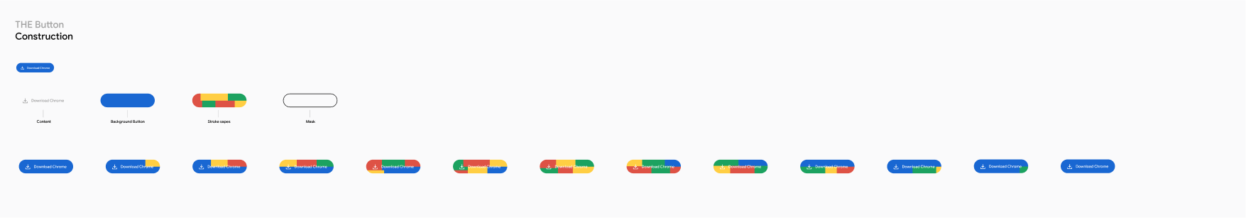
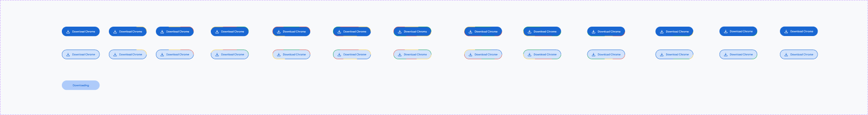
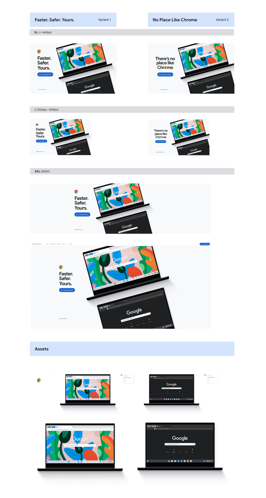
EXPLORATIONS/
We embarked on numerous explorations, creating a wide variety of buttons with different visual treatments and animations, incorporating various states. These designs underwent extensive review by the marketing departments of both Google and Chrome, ensuring we found the most captivating solution that adhered to Google's brand standards.
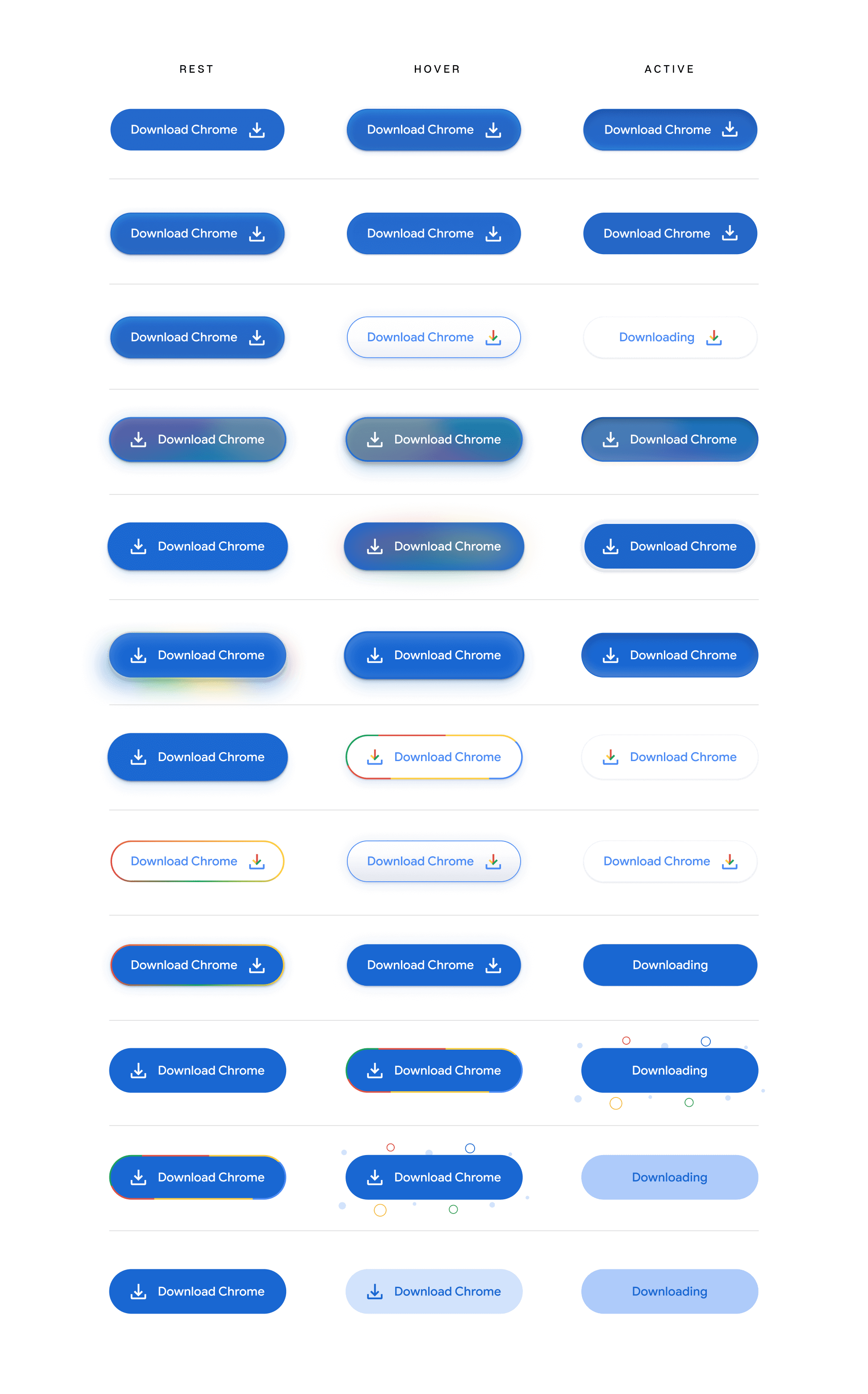
FINAL VERSION/
After numerous iterations and nearly three months of work, we arrived at a version that satisfied all parties involved, including the users. The final button design, with its captivating and dynamic visual elements, proved to be a success. The numbers spoke for themselves as the download count experienced a significant increase, clearly demonstrating that the objective was achieved.
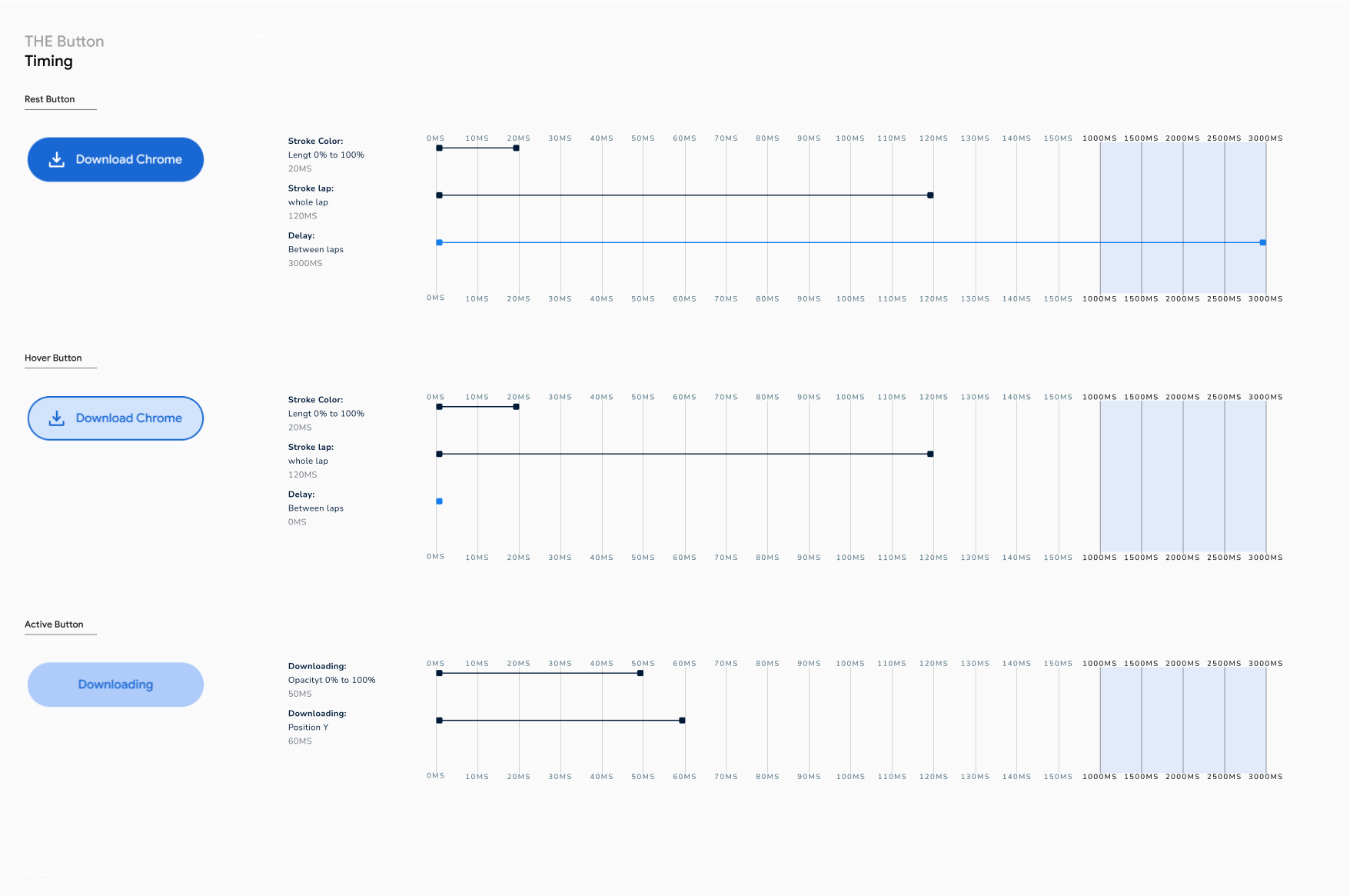
DELIVERABLE/
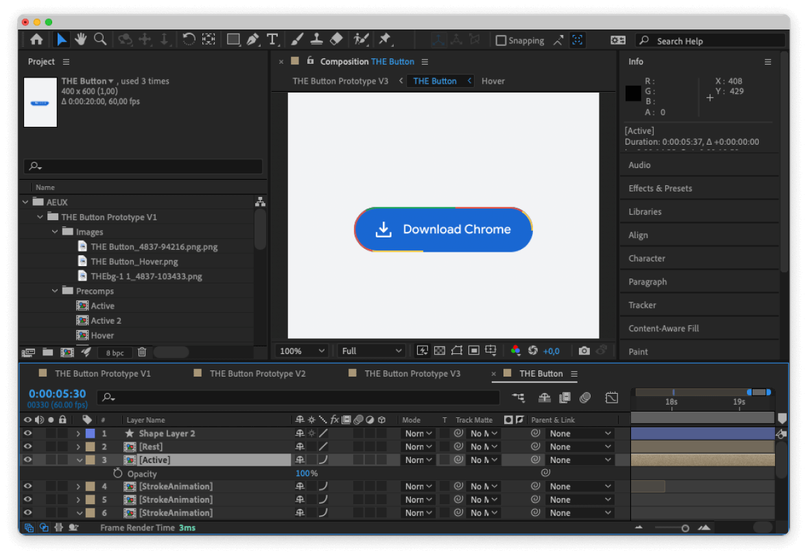
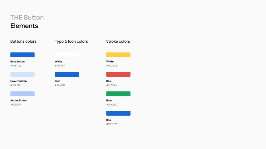
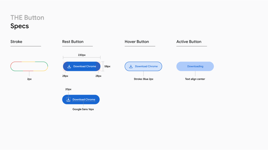
To ensure that the button was meticulously implemented by the developers and met the highest standards, we created a comprehensive file documenting the step-by-step process of the animation. This file included detailed information such as timing, sizing, and color specifications, providing clear guidance for the development team.
DR PAGE
A crucial part of our experimental laboratory, we developed the DR Page, a website specifically designed to increase Google Chrome traffic in targeted markets such as Australia, Europe, and others. This dedicated site served as a foundation for future Google Chrome designs, showcasing the browser's features, benefits, and encouraging users to download and explore Google Chrome further.
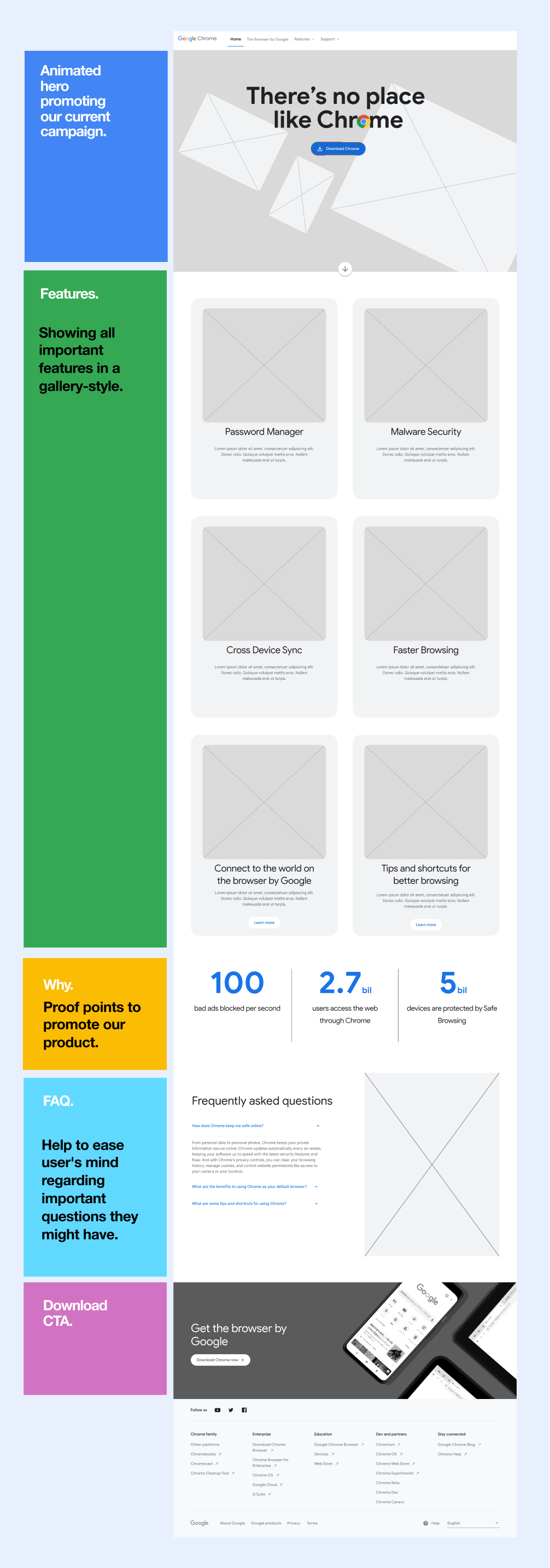
NARRATIVE & WIREFRAME/
Working closely with the UX designer, we crafted a narrative that was easy to understand and digest, highlighting the four key features of Google Chrome that set it apart from the competition. This narrative served as the foundation for creating clear and concise wireframes, ensuring a seamless user experience and effective communication of Chrome's unique selling points.
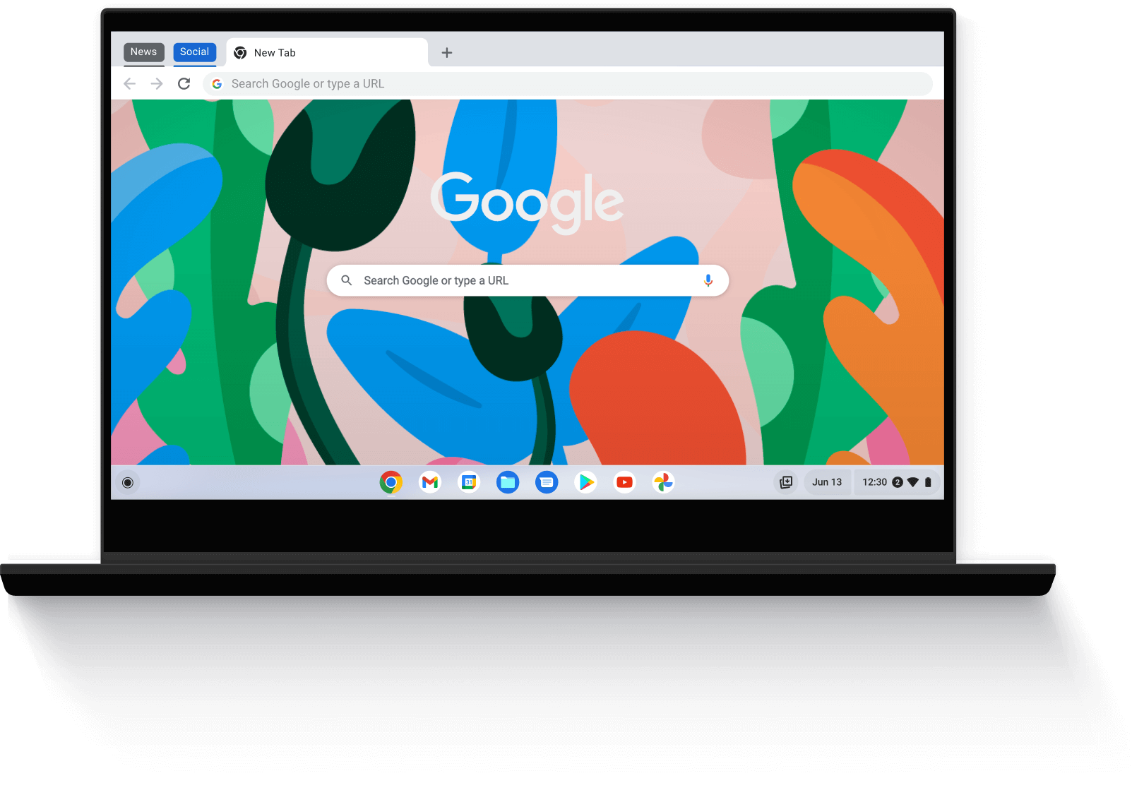
VISUAL EXPLORATIONS/
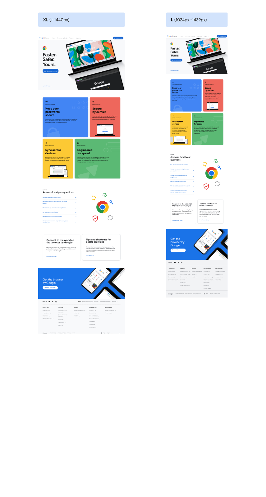
We aimed to create a more modern and dynamic visual language for Google Chrome. We experimented with the vibrant colors associated with Google Chrome, incorporating them in various elements to reinforce the brand identity. It was crucial to showcase the browser on different devices, providing users with a glimpse of how it would look on their computers. We conducted multiple iterations, refining illustrations, icons, and specific components to achieve a visually compelling and cohesive design.
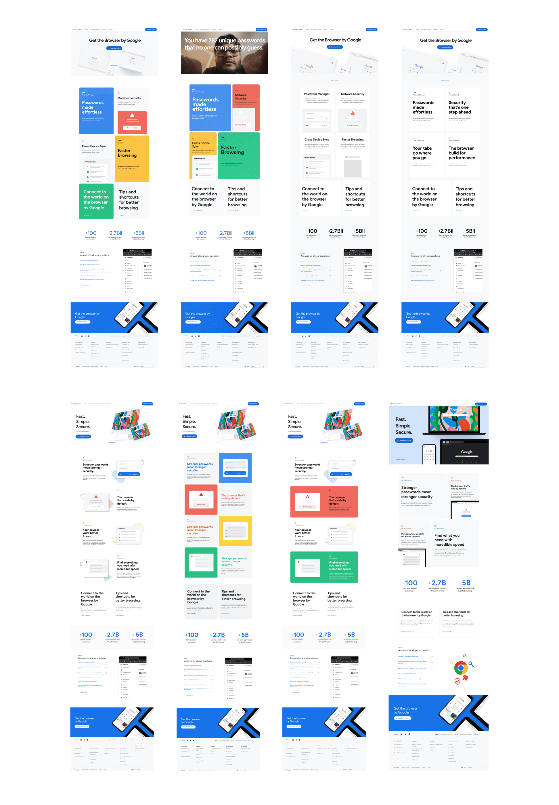
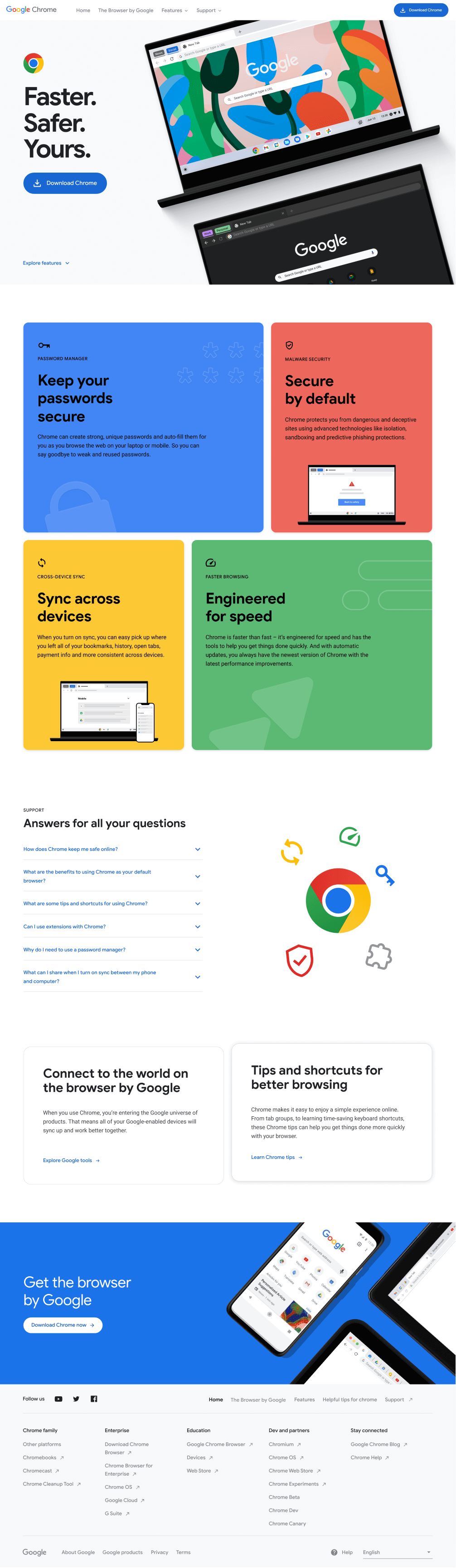
FINAL VERSION/
After an arduous work, we have arrived at this beautiful final version that embodies simplicity, vibrancy, and elegance. It meets the high standards set by Google in terms of visual aesthetics and accessibility. Every detail has been carefully crafted to create a seamless and engaging user experience.
MOTION/
We incorporated captivating micro-interactions that quickly engage users. These subtle yet impactful animations add a touch of dynamism to the overall experience, creating an immersive and enjoyable journey. From smooth transitions to interactive elements, every motion has been thoughtfully designed to enhance usability and evoke a sense of delight. The result is a visually captivating and seamlessly interactive website that keeps users coming back for more.
PASSWORD MANAGER
MALWARE SECURITY
CROSS-DEVICE SYNC
FASTER BROWSING
DELIVERABLE/
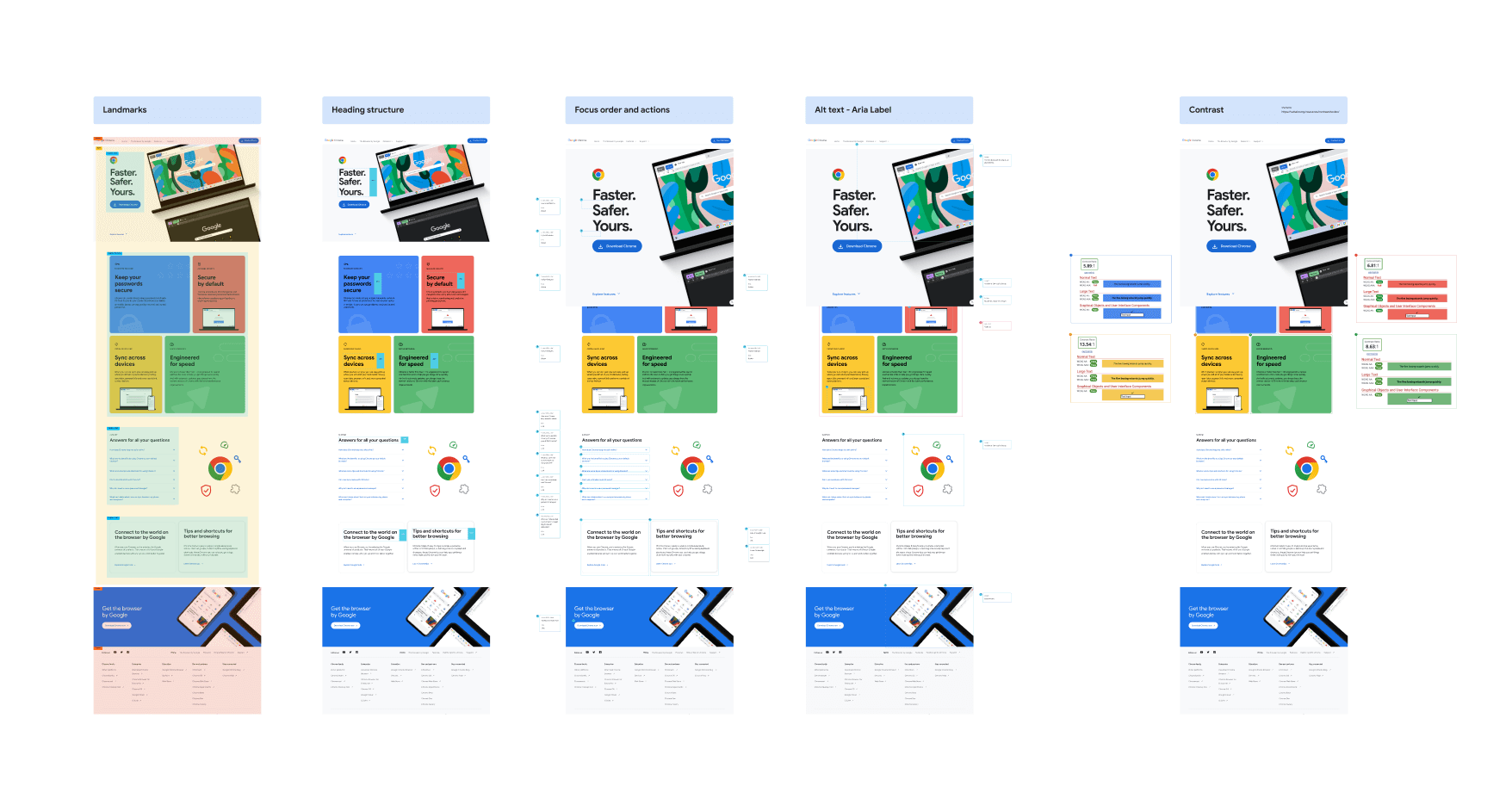
Since the website was initially intended for desktop and specific markets, we put great emphasis on providing clear and detailed specifications to the developers. This included precise measurements, typography guidelines, color codes, and any necessary assets to accurately translate our designs into functional code. By establishing a streamlined process and effective communication with the development team, we ensured the successful execution of our designs and a seamless user experience across devices and markets.
05/
LEARNINGS
During my time working on Google projects, I've had the opportunity to collaborate with exceptional talents. One of the key learnings has been adapting to the diverse needs of each client and their respective products. It has been a rewarding experience overall, filled with numerous challenges and valuable lessons. Working on these projects has undoubtedly been one of the highlights of my career, allowing me to push my boundaries, learn new skills, and grow both personally and professionally.

© 2026 — Illustrations by Godie Arboleda
